


2026-07-29 · Baduno Editorial Team · 29 Min. reading time · Blog & Knowledge
Data Visualization for Europe: Adapting Charts and Infographics Across 24 Languages Culturally
Whether bar chart or infographic: a data visualization optimized for all 24 EU languages requires more than just translation. Cultural color codes, varying reading directions, and country-specific number formats significantly influence perception. Our guide shows how to adapt charts so that they are intuitively understood in every European market – without misunderstandings or design breaks.
Fundamentals of Data Visualization for Multinational Audiences
When creating charts and infographics for European markets, you face the challenge of making your visualizations understandable across 24 languages and diverse cultural contexts. The first step is to reduce to the essentials: avoid cluttered graphics that become illegible due to text length changes in translation. Plan fixed layouts that withstand long German or Finnish terms. Use icons and symbols that are internationally recognized (e.g., arrows, circles, triangles) and not language-dependent.
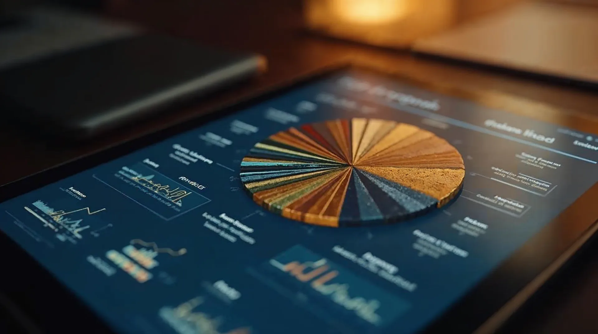
Also pay attention to the choice of chart types: bar charts, line charts, and scatter plots are read similarly across Europe, whereas pie charts are preferred in some countries like Sweden or the Netherlands, but less so in others. For multinational audiences, horizontal bar charts are recommended as they work well regardless of reading direction (left-to-right vs. right-to-left, the latter rare in Europe). For time series, always use a consistent time axis with local date formats.
A key recommendation: incorporate space for translations already in the design process. Bear in mind that texts in languages such as German or Hungarian can be up to 30% longer than in English. Use dynamic text sizes or collapsible labels. Test your visualizations with native speakers from at least three different language regions before rollout. Also note that number formats (decimal separators, thousand separators) vary by country. In Germany and Italy, the comma is used as decimal separator; in the UK and Ireland, the period. Consistency is essential here.
Avoid cultural references or humor in charts – what is considered funny in France may be irritating in Sweden. Instead, opt for a factual, clear presentation. Use a neutral color scale that does not evoke political or religious associations. Finally, localize legends and axis labels linguistically correctly and have them checked by a professional translator – statistical terminology can easily be misunderstood.
Cultural Differences in the Perception of Charts and Graphics
The way people read and interpret charts is culturally shaped. In Europe, there are differences in reading direction: most Western countries read left to right, but in Arabic-speaking contexts (e.g., Malta with English and Maltese) or among minorities, this may differ. However, left-to-right is dominant in the EU. Nevertheless, you should reconsider the order in bar charts: in some cultures, the highest priority is expected at the top or left; in others, at the bottom. Test the arrangement of your data with local users.
Another aspect is the acceptance of 3D effects or elaborate graphics. In Nordic countries like Scandinavia, a minimalist, functional style is preferred, maintaining a high data-ink ratio. In Southern European countries like Italy or Spain, more aesthetic, colorful representations are common. A practical recommendation: offer two variants – a plain version for professional B2B use and a more elaborate one for public presentations. Adjust this according to the target audience.
Perception of chart types varies: pie charts are appreciated in many countries, but in Bulgaria or Greece they are sometimes criticized as difficult to compare. Bar charts are better suited for comparisons. Additionally, the cultural context plays a role in trend interpretation: in uncertain markets, users expect a conservative presentation (e.g., with error bars), while in more optimistic cultures, a smooth trend line is accepted.
Recommendation: conduct a 'cultural audit' of your charts before publication. Have a small group of target audience members from different regions explain the graphics. Watch for misunderstandings regarding size perception (e.g., area vs. length) and interpretation of color gradients. Avoid misleading axes (not starting at zero) – this can be perceived as deception in all cultures. Document the results and iteratively adjust your design.
Color Coding and Symbolism in Different European Countries
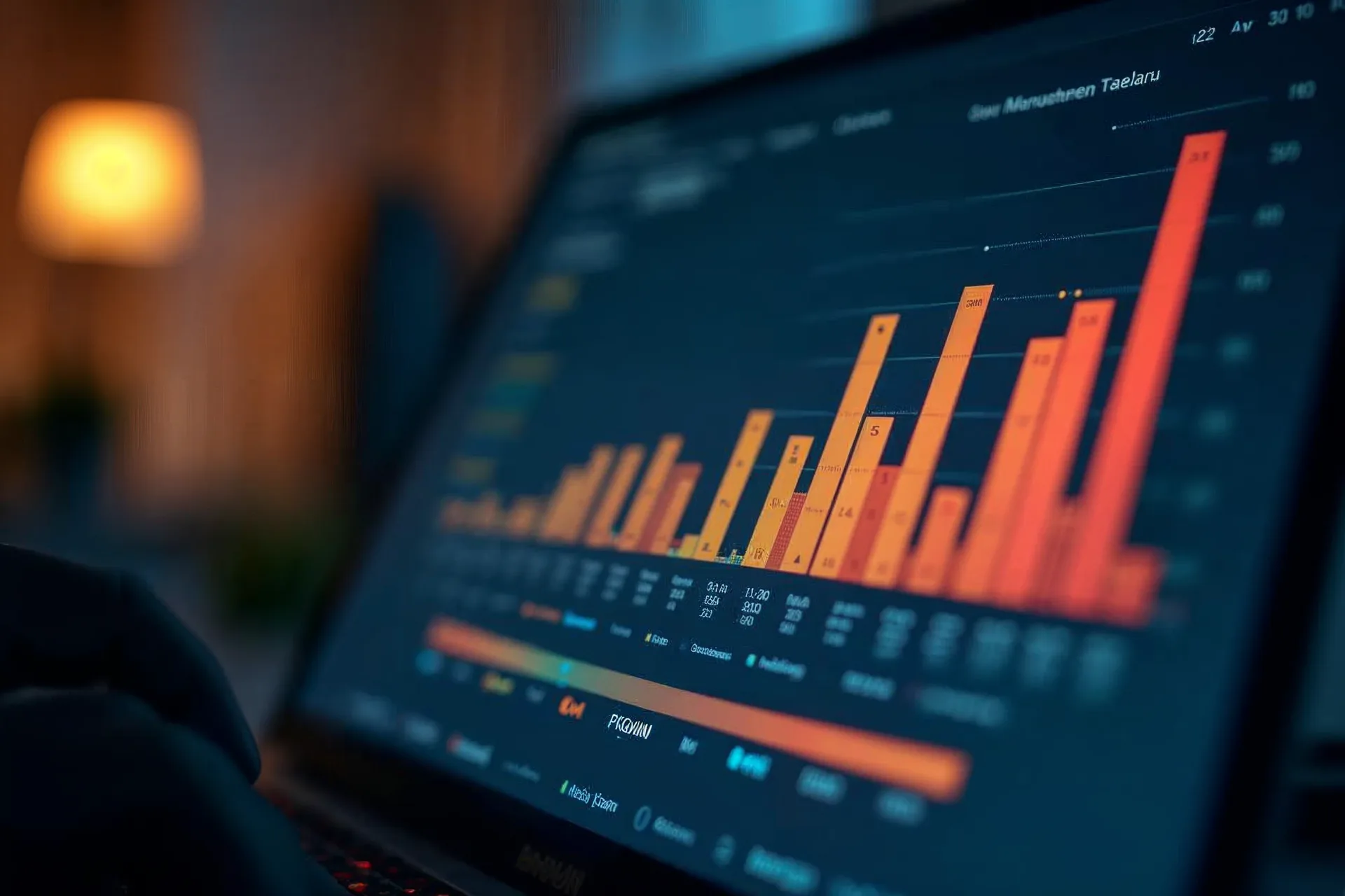
Colors have different meanings across Europe, which can lead to misinterpretations in data visualization. Red signifies danger or loss in many countries but is also used for positive signals like fire and passion. In countries with strong political associations (red for social democrats, black for conservatives), red can be polarizing. Green is often used for growth or the environment, but in some regions it is associated with envy or illness. A safe choice is blue for trust and neutrality, as it has positive connotations throughout Europe.
Yellow and gold are associated with religious festivals in Catholic countries (Italy, Spain, Poland), while in Northern Europe they are more often warning signals. Purple was historically an imperial color but is now often linked to mourning or spirituality (in Italy and Greece). For classifications, prefer color scales like blue-white-red heatmaps or pure gradients of a single color. Ensure sufficient contrast for accessibility—this is increasingly required by law in all EU countries.
Symbols and icons are also culturally sensitive: A checkmark (✓) means correct in Germany, a list in Sweden, but occasionally 'yes' in Greece—while a cross (✗) is often viewed negatively in Protestant countries (wrong) but can have positive religious meaning in Catholic countries. Instead, use neutral symbols like circles or stars for markers. The euro symbol (€) is unproblematic, but be aware of country-specific variations in displaying percent signs or units of measurement.
A concrete recommendation: Develop a color scheme based on a neutral spectrum (e.g., blue tones) and use culturally specific colors only when you know the target audience exactly. Test the symbolism in your infographic with focus groups from France, Germany, and Poland. Always use patterns or hatching for color highlighting so the graphic works even in black-and-white print. When in doubt, consult a legal advisor on country-specific color regulations (e.g., for warnings). This ensures your data visualization is correctly understood throughout Europe.
Linguistic Localization of Axis Labels and Legends
Correctly translating axis labels and legends is a crucial step in making data visualizations understandable for European target audiences. A literal translation is rarely sufficient, as technical terms, abbreviations, and units of measurement are handled differently across the 24 EU languages. For example, 'revenue' is referred to as 'Erlös' or 'Umsatz' in German depending on context, while French distinguishes between 'chiffre d’affaires' and 'recette'. Abbreviations like 'Mio.' (German) and 'M' (English) can cause confusion in a chart if not language-specifically adapted.
A common issue is text length: German compound words like 'Durchschnittstemperatur' require more space than English 'Avg Temp'. In tight axis labels, use standard abbreviations common in the target language—for example, 'Ø Temp' in German or 'Temp. moy.' in French. For legends, it is important to use consistent terminology across the entire dashboard or infographic to avoid confusion. Have all texts reviewed by native-speaking professionals who also understand the respective field (e.g., finance, technology).
When displaying units like 'km/h' or '€', note that countries like Germany and Austria place '€' before the amount, while others like France place the currency symbol after the amount ('10 €' vs. '€10'). Spaces between number and unit also vary: a non-breaking space is common in French but not always in German. Also pay attention to the use of decimal separators in labels (see next chapter). A proven practice is to create a separate layout template per language and test text lengths in a mockup before publication—this avoids overflowing text or disruptive line breaks.
Concrete recommendation: Create a glossary for each target language with the most important technical terms and their translations. When creating charts, use tools that allow language-specific text adjustments (e.g., separate text fields for labels instead of embedded texts). Avoid English default texts, even if the target audience includes international readers—the native language increases reading speed and trust in the data.
Adaptation of Number Formats, Units, and Decimal Separators
Number formats are a frequent stumbling block in European data visualization, as the notation for decimal separators, thousands separators, and measurement units varies significantly between languages. In German and French, a comma is used as the decimal separator (e.g., 1.234,56), while in English a period is used (1,234.56). The thousands separator in German is sometimes a period (1.234), in French a space (1 234) or a period for currencies. In many other EU languages such as Spanish or Italian, you will find similar variants. If you ignore these conventions, “1.234” could mean 1,234 (one thousand two hundred thirty-four) for a German reader or 1.234 (one point two three four) for a Spanish reader — a significant interpretation error.
Measurement units are mostly metric in the EU, but there are exceptions: In the United Kingdom — which is no longer part of the EU but relevant for some audiences — miles, feet, and degrees Fahrenheit are used. Even within the EU, traditional units exist: In Germany, “Pfund” (500 g) is used in everyday life; in France, “livre” (500 g). For weight data, you should therefore either use the SI unit (kilogram) consistently or offer a conversion, for example in a footnote or via an alternative chart. For currency amounts, the respective symbol (€, £, zł) suffices — but pay attention to positioning (see previous chapter).
Another aspect is percentages and ratios: In some countries, the percent sign is placed before the number (“%10”), but in most EU states it is placed after (“10%”). It is recommended to apply formatting based on local locale settings (e.g., CLDR data) and to conduct a test with native speakers before publication. In interactive visualizations, you can also use automatic detection of the browser locale to dynamically adjust the number format — however, this requires careful implementation and fallback logic.
Recommended actions: Define a set of formatting rules for each target language (decimal separator, thousands separator, currency position, units). Use libraries such as “Intl.NumberFormat” in JavaScript or corresponding functionalities in BI tools (e.g., Power BI, Tableau) to apply these rules automatically. Check in your workflow whether the formatting is correctly adopted in exports (PDF, image). A pragmatic approach is to create a sample chart with all relevant number types and have it proofread by a local reviewer in each language.
Presenting date and time formats correctly in the 24 EU languages
The representation of date and time information varies considerably across the 24 EU languages and can lead to misunderstandings or misinterpretations if ignored. The basic order of day, month, and year is not uniform: In most EU countries, the order day.month.year is used (e.g., 31.12.2025 in Germany, 31/12/2025 in France). In contrast, the American notation month/day/year should generally be avoided in EU contexts. Some countries such as Sweden or Finland officially use the ISO notation (2025-12-31), which is also common in technical contexts. It is important to consistently apply the notation customary for the target audience.
The names of months and weekdays must be translated into the respective target language. Pay attention to language-specific peculiarities: In German, all nouns are capitalized; in French and Spanish, they are written in lowercase. Abbreviations should also be country-specific — “Jan.” works in German, “janv.” in French, “Ene” in Spanish. In infographics that contain multiple languages, it is advisable to spell out month names to avoid confusion (e.g., “Dezember” vs. “Dec” vs. “Dic”). For time indication, most EU countries use the 24-hour format („14:30”), while some Anglo-Saxon contexts use the 12-hour notation with AM/PM. Stick to the 24-hour format unless there are specific reasons against it.
Another cultural aspect is the start of the week: In most EU countries, the week begins on Monday; in some (e.g., Portugal, parts of Germany), Sunday is sometimes considered the first day. In timelines or calendar views, the customary order should be chosen. Also note the different spellings for years — in German often without a period (“2025”), in Italian sometimes with a period after the year. Concrete recommendations: Use an international standard such as CLDR (Common Locale Data Repository) for correct formatting. Test all date entries in a table with the 24 relevant locales. Avoid numerical formats that could be ambiguous (e.g., 03/04/2025 — which month?) by spelling out the month name or using the ISO notation 2025-04-03. In infographics, always place date information near the corresponding data point and ensure consistent formatting across all charts.

Reading direction and visual hierarchy in international infographics
Reading direction influences how your audience perceives an infographic. While in German, English, or French, the eye moves from top left to bottom right, Arabic users read from right to left. For the 24 EU languages, Latin script with left-to-right reading direction is standard – with the exception of Greek, which also reads left-to-right. However, there are cultural differences: Scandinavian countries often expect a strictly linear hierarchy, while Southern European audiences handle dynamic, non-linear layouts better.
In practical terms: Always place the most important information in the top-left area, as this is the natural focal point. Use a clear reading path with arrows or numbered steps if the infographic contains multiple elements. For comparisons or timelines, the arrangement from left to right should reflect the chronological sequence. However, for multilingual versions, you need to check whether the hierarchy remains intact when texts are translated into longer versions – for example, when a short English sentence becomes a long German sentence and the visual balance shifts.
Also pay attention to size ratios: In Western Europe, larger is interpreted as more important, but in Eastern European countries, centered placement can also be seen as higher in hierarchy. Test your infographic with some native speakers from the target countries to ensure the reading direction is intuitive. A simple test: Ask subjects to name the element they consider most important – does the perception align?
Recommendation: Create a basic layout with clearly defined placeholders for text and graphics. Then localize not only the text but also, if necessary, adjust the arrangement of captions or legends to the typical reading direction. Use grids to maintain consistency across all language versions – but be flexible with length differences. Also consider the mobile view: Smartphone usage is high in many European countries, so the hierarchy should work on small screens as well.
Accessibility in Multilingual Visualizations
Accessibility in visualizations means that people with visual impairments, color blindness, or cognitive limitations can also grasp the data. In Europe, guidelines such as EN 301 549 for accessibility of ICT products apply. For multilingual infographics and charts, you must meet these requirements in every language version – this affects both color choice and text alternatives.
A common problem: Color coding is problematic for 8 to 10 percent of European men with red-green blindness. Therefore, in addition to color, also use patterns, symbols, or text labels. In EU-compliant implementation, you should maintain contrast ratios of at least 4.5:1 for normal text and 3:1 for large text. Use tools like the Colour Contrast Analyser to check this. Also ensure sufficient font sizes – 12 points or more – and avoid serifs in long text blocks in infographics.
For multilingual accessibility, you need an alternative text per language that describes the content of the graphic. This should not only state the data but also the key message. Example: Instead of "Bar chart of 2024 revenues", better: "Bar chart: 2024 revenue in Germany €15.2M, France €12.8M, Italy €9.3M – Germany leads." This alt text must be created separately for each language version and correctly translated. Also, the labels in the chart itself (axes, legends) should be provided as selectable text, not as images, so that screen readers can read them.
Recommendation: Develop a template that is accessible from the start: high contrast, redundant coding, clear fonts. Test each language version with a screen reader (e.g., NVDA or VoiceOver). Note that Scandinavian countries have strict requirements for digital accessibility (e.g., WCAG 2.1 AA). Ideally, have the implementation checked by an accessibility expert. Also consider cognitive accessibility: Avoid cluttered diagrams, focus on clear statements and a logical structure – this helps all users.
Additionally: Provide the data in an alternative tabular form, e.g., as a linked table below the infographic. This is not only accessible but also allows users to process the data themselves. In practice, accessible visualization often increases usability for everyone.
Tools and Workflows for Mass Localization of Charts
Localizing dozens of charts across 24 languages requires an efficient workflow. Manual post-editing is time-consuming and error-prone. That’s why it’s best to rely on tools that pull data from a single source and generate charts automatically, whose labels can then be edited in a translation management system (TMS).
A proven approach is combining a business intelligence tool like Tableau, Power BI, or Google Data Studio with an export plugin that extracts the meta layer (texts, labels, legends). These texts are translated in the TMS – ideally using translation memory to ensure consistent terminology across all charts. Alternatively, you can use custom scripts in Python (e.g., with Matplotlib) or R (ggplot2) that pull chart texts from a central language pack. This way, you only need one codebase and swap out the language pack.
An efficient workflow looks like this: 1. Define a data structure containing all text-relevant fields (axis titles, legends, tooltips, annotations). 2. Store these fields in a table with 24 language columns. 3. Use a template (e.g., in Excel or JSON) that your visualization software reads. 4. Generate all charts in a batch run. 5. Spot-check a few languages visually – especially for text overflow and correct number formats.
Recommendation: Invest in a centralized translation memory for your chart texts. Use glossaries for technical terms that must be translated consistently across all charts. Ensure your toolchain supports importing translations from a TMS via API. For small series, manual translation directly in the software is also feasible – but balance effort and quality. Before mass production, test your workflow with two or three representative languages (e.g., German, French, Polish). Then optimize text fields so translations fit available layouts. Allocate time for post-processing: charts with widely varying text lengths (e.g., Finnish vs. English) may require manual layout adjustments.
Additionally: Use versioning for your chart templates – so you can trace which chart version belongs to which dataset and whether translations are up to date. An automatic check for missing translations or formatting errors (e.g., wrong decimal separators) should be part of the build process.
Whether bar chart or infographic: a data visualization optimized for all 24 EU languages requires more than just translation. Cultural color codes, varying reading directions, and country-specific number formats significantly influence perception. Our guide shows how to adapt charts so that they are intuitively understood in every European market – without misunderstandings or design breaks.
Quality Assurance: Common Mistakes and How to Avoid Them
A key mistake in localizing data visualizations is incomplete translation of all text elements. Axis labels, legends, tooltips, and source references are often only partially captured. Therefore, check each component systematically: use a checklist of all text-based elements and have a native speaker proofread them. Pay special attention to multi-line text in tight chart areas, as translated terms can be longer. For example, “Durchschnittliche monatliche Niederschlagsmenge” in German may overload the graphic, while the English source was shorter.
Another common mistake involves number and unit formats. Decimal separators, thousand separators, and currency symbols must be adapted per country. In Germany, 1.234,56 € is written, in France 1 234,56 €, and in Ireland €1,234.56. Check each number manually or set automated formatting rules in your tool. Percentages and fractions also vary: Spain uses 12.5%, Denmark 12.5%. A consistent style guide for each target country helps avoid such errors.
Color codes and symbols are also error-prone. Red often means negative in Sweden, but in Belgium it represents the Flemish community – political or cultural connotations can distort your message. Check each color for unwanted associations and test the graphic with local users. Symbols like checkmarks or crosses have different meanings depending on the country: in Greece, a nod does not necessarily mean approval, a cross can mean “incorrect” or “selected.” Create a reference table of prohibited and recommended symbols per market.
Ensure the reading direction of the visualization matches the natural reading direction of the target language. For German, English, French, or Italian, left-to-right is standard. The same applies to Greek or languages with Latin script. However, the arrangement of comparison bars or the order in legends may be interpreted differently culturally. Have a native speaker review the entire infographic for comprehensibility and logical structure. A structured QA process with multiple review stages – automated format checks, linguistic review by linguists, and visual review by graphic designers – significantly reduces the error rate.

Case Studies: Before-and-After Comparisons of Localized Infographics
A practical example illustrates the implementation of a line chart showing monthly temperature trends for Germany and France. In the original, months were abbreviated in English (Jan, Feb …) and temperatures were given in Fahrenheit. After localization, the month names were changed to “Jan.”, “Feb.”, etc. (Greek month names for the Greek market, accordingly), and the unit was switched to degrees Celsius. The date format was also adjusted from mm/dd to dd.mm for Germany and yy/mm/dd for France. In the legend, “Temperature in °F” was replaced by “Temperatur in °C”, and the axis labels received a complete German sentence: “Monatliche Durchschnittstemperatur in Berlin”. The colors remained neutral (blue for cold, red for warm), as these are interpreted similarly in both countries.
Another case study involves a bar chart showing revenue distribution by product category. The original used decimal and thousand separators per US convention (e.g., 1,234.56). The localized version for Spain used Spanish formatting (1.234,56 €) and indicated the currency with “EUR”. Additionally, the order of categories was changed: in Scandinavia, users expected the most important category at the top, while the original used alphabetical sorting. After consulting with local stakeholders, the order was sorted by revenue size. The bar labels were also rounded from numbers with two decimal places to whole numbers with one decimal place to improve readability.
An infographic on EU population development originally showed all countries in a single chart. After localization, separate graphics were created for each language area to set local priorities. For the Polish market, Poland was highlighted in color and the population figure was shown in millions with a comma as the decimal separator. The source citation was translated into Polish and adapted to the local data source (GUS). In the German version, the same graphic was provided with German labels and the source “Destatis”. This approach avoids confusion from meaningless abbreviations and increases acceptance among the localized audience.
A final example shows a map with colored regions. In the original, green represented high values and red low values. For the Greek market, the color scale was reversed because red historically carries negative associations. Instead, a blue-yellow gradient was chosen. The legend was fully translated, including the units (e.g., “Unemployment rate in %”). City labels on the map were converted to local spelling (e.g., Munich instead of Munich). This adjustment prevented misunderstandings and ensured a clear, culturally appropriate representation of the data.
Integration into Content Management Systems and Shop Systems
The technical integration of localized visualizations into CMS and shop systems requires a well-thought-out structure. Store charts as separate assets with language-specific variants. Use named file suffixes such as infografik_de.png, infografik_fr.png, etc., or use a media asset management system that captures language metadata. For dynamic graphics generated via plugins, store the translations for axis labels, legends, and tooltips directly in the plugin settings. Many common tools like Chart.js or Highcharts support internationalization through language packs that can be configured per country.
For e-commerce platforms like Magento or Shopware, it is crucial that product comparisons and price charts automatically use the correct currency and number formatting. Use the system's standard localization functions: set the preferred formats for each store view (e.g., de_DE, fr_FR). If you use external chart libraries, integrate them via a central template and pass the language-specific parameters from the current locale. Ensure that responsive layouts are optimized for longer text strings—test with the longest translations, e.g., Finnish compounds.
Another aspect is performance: high-resolution localized files can increase loading times. Where appropriate, use SVGs with embedded text that are replaced server-side with the correct language version. Alternatively, you can display the text via CSS or JavaScript, which reduces file maintenance effort. For multi-use charts, we recommend a caching mechanism that generates the variants once and then makes them available for all language versions. Also plan for data source updates—a central dashboard that updates all language versions simultaneously saves time.
Ensure that the output is accessible in all languages. Alt texts and image descriptions must be stored in the respective target language. For interactive charts, screen readers should read out the localized version of the data. Check integration with your translation management: pass the text elements from the visualizations as part of the translation workflow. Tools like the Baduno platform offer interfaces to CMS and PIM systems, so chart labels are automatically included in the translation process. Finally, test all language variants in the live environment to catch layout breaks or incorrect formatting early on.
Checklist for the Final Approval of a European Visualization
Before publishing a localized visualization, it should undergo systematic review. Use this checklist to ensure your charts and infographics are accurate and understandable in all 24 languages. This goes beyond translation accuracy to include cultural fit, technical correctness, and readability.
First, check the language versions: Do all axis labels and legends match the target language exactly? Are translations consistent—e.g., "Januar" instead of "Jan" in German? Pay attention to date formats (DD.MM.YYYY vs. MM/DD/YYYY), decimal separators (comma vs. period), and currency units (EUR with euro sign). Check number formats: thousand separators (period in German, space in French). Have each language version proofread by a native speaker.
Visual elements: Do colors match cultural connotations? For example, green in Ireland means luck but in some contexts envy. Red can signify losses in German finance but gains in other countries. Symbols like flags, hands, or gestures should be neutral or regionally adapted. Check reading direction: For infographics on a multilingual website, a uniform left-to-right alignment may suffice, but for Middle Eastern languages, mirroring is necessary—think Hebrew and Arabic.
Technical review: Are all fonts (e.g., Cyrillic, Greek) displayed correctly? Are data points and labels cut off for longer text (German compound words)? Test interactive elements: tooltips, filters, and animations should work in every language without text loss. Ensure responsive display: especially on mobile devices, text may overlap. Use placeholder templates for each language layout if needed.
Finally, document the review process: Who approved what and when? Maintain versioning of localized visualization files. A central asset management system helps avoid inconsistent updates. Conduct regular spot checks, even after raw data updates. Coordinate this checklist with your legal team if regulatory requirements such as the EU-wide accessibility directive are affected.
Outlook: Trends and Future Challenges in Data Localization
The localization of data visualizations is becoming increasingly challenging due to technological and societal developments. Three trends are emerging that affect both companies and localization service providers: the rise of dynamic and personalized visualizations, increased data and accessibility regulation, and the use of AI translations with subsequent quality assurance.
First: More and more websites and shop systems are adopting interactive, data-driven graphics that adapt in real time to user behavior or region. Such dynamic visualizations require localization that encompasses not just text but also logic: Are color codings automatically adjusted per country? Does reading direction change when language switches? This calls for modular data sources and scalable design systems that store cultural parameters as variables.
Second: The EU is tightening requirements for accessibility (e.g., EN 301 549) and data protection (GDPR). Visualizations must be optimized for screen readers – with meaningful alternative texts in all languages. Securing data sources is also becoming more important: localized infographics should be able to trace which data is used in which language. Legally, it needs to be clarified whether translations constitute “processing” of data – seek separate legal advice here.
Third: Artificial intelligence is accelerating the translation of axes, legends, and tooltips. But purely machine translation hits limits with technical terms, units, or cultural metaphors. In practice, a hybrid approach has proven effective: AI provides raw translations that native speakers review and adapt. In the future, visual AI tools will also enable real-time redesign of color palettes or symbols. The challenge remains to maintain consistency across all 24 languages while hitting local nuances.
Companies should invest early in flexible localization workflows that cover both static and dynamic content. Standardized formats like SVG or JSON with language grouping facilitate automation. Regular monitoring of language quality and user feedback (e.g., via interaction heatmaps) helps continuously improve localized visualizations. The future belongs to adaptive systems that not only translate but culturally translate – without the user noticing a difference.
Practical Example: Step-by-Step Localization of a Complex Infographic
Suppose you have a line chart showing monthly CO₂ trends in the EU, originally created in German. Step 1: Analyze the source graphic. Extract all textual elements: title, axis labels, legend, data labels, footnotes, and any annotations. In this example, there are 8 month abbreviations, 5 year numbers, 3 line series, and a source citation. Step 2: Cultural check. The colors blue, green, and orange are neutral in all EU countries, but check whether the green used has a special association in Ireland or Cyprus (e.g., political parties). In our case, the green is harmless. Step 3: Translate the texts. Create a spreadsheet with 24 languages. Pay attention to order: In some languages (e.g., Greek), month abbreviations have different lengths, which can affect axis arrangement. For the year 2024, use Arabic numerals in all languages, but in Hungary and Finland, the date is often written as '2024. January'—adjust the label accordingly. Step 4: Technical adjustment. Use a template that supports fonts with Latin and Cyrillic characters (e.g., Noto Sans). Define that texts automatically wrap or scale if they are longer. In practice, a 45-degree rotation has proven effective for long axis texts. Step 5: Quality assurance. Have the localized graphic proofread by a native speaker who also understands the numerical logic. Ensure decimal separators are correct: In Germany it's the comma, in the UK the dot. Step 6: Final output. Export each language version as a separate SVG or PNG. If using dynamic charts in a CMS, embed the translations via a JSON file. This process repeats for each additional infographic; after the first run, steps are reduced to about 60% of the original effort through reuse of glossaries and templates.
Pitfalls and Tripwires in Localizing Visualizations
Localizing charts and infographics involves several typical pitfalls that can impair understanding and credibility. A common mistake is assuming that a simple translation of text elements suffices. In practice, adapting the visualization often requires more profound changes. For example, axis labels can be significantly longer in one language than in the original. If the chart size is not flexible, this leads to truncated texts or overlapping labels. One solution is to calculate the available space during the design phase using placeholders for the longest target language.
Another tripwire is invisible cultural associations. For instance, in Scandinavia, a red line is often interpreted as a warning or negative, while in Southern Europe it can be neutral or positive. This layer of meaning cannot be captured in automated translations. The use of hands or gestures in infographics can also be problematic: A thumbs-up gesture has an offensive meaning in Greece. Such image content must be reviewed by a native speaker with cultural awareness.
The choice of chart types themselves can also lead to misunderstandings. While bar charts and pie charts are standard in Germany, in some countries—such as France—line charts are preferred for comparisons. Experienced localizers therefore sometimes adapt the chart type without distorting the data. Another hurdle is fonts: Not every font supports all special characters of the 24 EU languages. The absence of glyphs for Romanian or Polish letters leads to illegible labels. Using OpenType fonts with an extensive character set is recommended here.
Finally, the technical aspect should not be underestimated. If visualizations are exported as images, the texts are not searchable or accessible. Scalable vector formats (SVG) with embedded fonts are better. Embedding right-to-left languages such as Maltese or Greek into a left-to-right environment also requires special handling. An audit with real users from the target countries reliably uncovers these pitfalls—a step that saves time and correction loops.
Budget and Effort: Realistically Assessing Cost Factors
Localizing data visualizations for 24 EU languages is no standard translation project. The costs consist of several components that many clients underestimate. The most obvious item is the translation of text elements: axis labels, legends, tooltips, annotations. Here, native speakers with expertise in data visualization can make a difference – their hourly rate is typically 20–30% higher than that of a general translator. In addition, linguistic checks for cultural specifics, such as colors or symbols, add to the cost.
The second major cost block is technical adaptation. If the visualization is in graphic form, separate files are often required per language. For dynamic charts (e.g., JavaScript-based), costs arise for implementing language switches and adjusting layout logic for different text lengths. For 24 languages, this can quickly mean several development days. Better scalability is achieved by using localization frameworks that automatically handle text lengths – however, setting up such systems is initially labor-intensive.
Further cost factors are quality assurance and proofreading. Per language, at least two review rounds should be planned: one by a linguist and one by a subject-matter expert from the target market. For specialized topics such as financial indicators or scientific data, additional reviews by domain experts are necessary. These costs are not trivial, but they avoid embarrassing errors that damage the trust of the target audience.
To realistically assess the effort, a pilot phase with two to three languages is recommended. Here you can test workflows, measure time requirements, and evaluate quality before scaling to all 24 languages. Build in buffers for unexpected requirements, such as subsequent data changes or modified legal requirements (e.g., GDPR notes in charts). A well-calculated budget also considers maintenance: when source data is updated, all language versions must be updated – an ongoing cost factor that long-term projects should not neglect.
FAQs
How do I account for cultural color associations in different EU countries?
In practice, colors often carry different meanings across countries. While red frequently denotes danger in Germany, it symbolizes positive concepts like love in some Southern European countries. Therefore, for each target language, examine cultural color codes and employ neutral or adaptable palettes. A color test with native speakers helps detect misinterpretations early.
What challenges arise when localizing number formats?
EU countries use different decimal and thousand separators: In Germany, a period is the thousand separator and a comma the decimal mark, while in the UK it is exactly the opposite. Currencies and units also vary (e.g., liters vs. gallons). Automated conversions in tools are prone to errors. Manual verification of all numbers in each language version is essential.
How do I ensure that diagrams are accessible in all languages?
Accessibility includes alt texts for diagram descriptions, sufficient color contrasts, and a logical reading order. Each language version requires its own alt texts that precisely describe the content. Use high-contrast color schemes that can be distinguished even by users with color vision deficiencies. Test with screen readers in the respective language to ensure correct output.