



2026-07-20 · Baduno Editorial Team · 28 Min. reading time · Blog & Knowledge
Color Symbolism in Europe: How Colors Evoke Local Emotions and Strengthen Brands
Colors are more than design: They convey deeply rooted cultural messages. In Europe, color meanings vary from north to south – what stands for trust in Scandinavia may trigger rejection in Southern Europe. Our guide shows you how to optimally localize your color palette for each European market, maintain brand identity, and avoid emotional pitfalls. Practical with checklist and methods.

Significance of Color Symbolism in the European Market
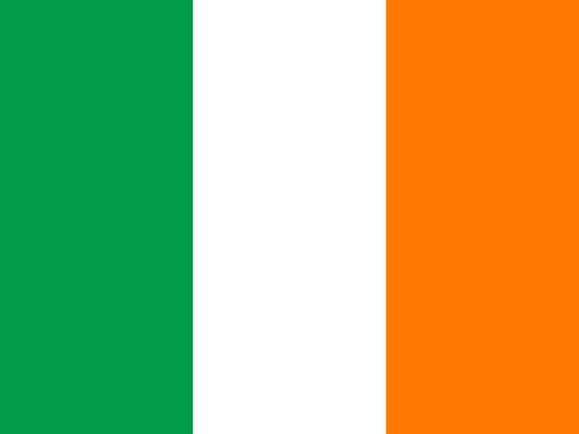
Colors convey deeply rooted cultural messages that go far beyond mere aesthetic impression. In Europe, a continent with diverse historical and linguistic traditions, the same colors can evoke completely different associations in different countries. For companies aiming to position their brands and products across Europe, understanding these symbolic differences is therefore a crucial factor for successful visual localization. A striking example is the color green: In many Northern European countries, it stands for environmental awareness and sustainability, while in Ireland it is strongly associated with the national holiday St. Patrick’s Day and luck. In contrast, green can also have negative connotations such as illness or envy in some Southern European countries.
The importance of color symbolism is particularly evident in the branding of international companies. A logo design that conveys professionalism and seriousness in Germany – for example through the use of blue tones – might be perceived as cold or aloof in Italy. Conversely, consumers in Southern Europe often associate warm colors like red or orange with passion and sociability, while these colors may be considered aggressive or intrusive in Northern Europe. Such cultural differences not only influence the emotional impact of advertising materials but also brand perception and ultimately purchasing decisions.
A practical example of the need for adapted color symbolism is the launch of a product in several European countries. If a company designs a yellow package, it should consider that yellow is often associated with envy or jealousy in Germany, while it symbolizes sun and optimism in Spain. In France, yellow was historically considered the color of betrayal in the Middle Ages, a nuance that still subtly persists today. To avoid such pitfalls, thorough research of country-specific color meanings is essential. We recommend creating a cultural color map for each target country that lists positive and negative associations as well as common use cases.
Furthermore, companies should consider current cultural dynamics: color meanings are not static but subject to societal change. For example, white has evolved in many European countries from the symbolic color of innocence to a color of modernity and simplicity, as expressed in the minimalist design aesthetics of Scandinavia. In practice, this means: test your color concepts with representative user groups in the target markets. Have local experts evaluate the emotional impact of your visual elements before launching a pan-European campaign. This ensures that your brand color truly conveys the desired local feeling.
Fundamentals of Color Perception and Psychology
The perception of colors is a complex process involving both physiological and psychological components. Biologically, humans perceive color through cones in the retina that respond to red, green, and blue. These primary colors are processed in the brain into a color impression. However, the interpretation of a color is strongly culturally shaped: what is perceived as harmonious in one region may be considered disturbing or inappropriate in another. Color psychology examines how colors influence emotions and behavior. Blue is often associated with trust and calm, red with excitement and danger – but these effects vary depending on context and cultural background.
A central concept in color psychology is color temperature. Warm colors like red, orange, and yellow are perceived as activating and close, while cool colors like blue and green tend to be calming and distant. However, studies show that this classification is not universal: in Southern European countries, where warm sunny tones are common, strong reds may be perceived as inviting, while in Northern Europe they are considered intrusive. The brightness and saturation of a color also play a role. Pastel tones are often associated with softness and femininity, while bold colors signify energy and modernity – but these relationships are not consistent across all cultures.
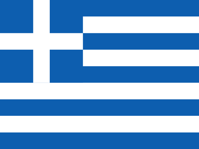
For localization practice, it is important to understand that colors do not act in isolation but in combination with shapes, typography, and other design elements. A red background may be seen as a lucky color in one country (like in China), but in Europe it is interpreted differently depending on context: in Sweden, red stands for joy of life; in Germany, in traffic contexts, it represents danger. Therefore, companies should not only test individual colors but entire color schemes. A helpful tool is the use of color association tables that list typical associations for each target country – for example, for blue: in Great Britain tradition and restraint, in Greece the color of the national flag and the sea, in the Netherlands the color of the royal house.
It is also recommended to consider color symbolism in relation to industry contexts. While blue and green represent stability in the financial sector in many countries, red may stimulate appetite in the food industry. To systematically capture these effects, companies can create a color context matrix that lists suitable and avoidable color tones for each industry and target country. Additionally, accessibility should be considered: about eight percent of the European population has red-green color blindness, which necessitates the choice of high-contrast colors. By combining psychological insights with cultural and functional requirements, you improve the local effectiveness of your visual communication.

Methods for Researching Cultural Color Meanings
To make well-informed decisions about color selection in various European markets, systematic research methods are essential. A primary starting point is the scientific literature on color symbolism, such as ethnological studies or cross-cultural comparisons. Universities and research institutes regularly publish studies analyzing the meaning of colors in specific countries. Additionally, specialized books on intercultural communication often provide extensive tables on national color associations. One example is the difference in color perception between Protestant-influenced Northern European countries and Catholic-influenced Southern European regions, evident in the use of gold and violet.
A second important method is qualitative research through local experts. Native cultural mediators, designers, or market researchers from the target markets can offer valuable insights not found in statistical data. Conduct guided interviews or focus groups where you present specific color combinations and logos. Ask about spontaneous associations, emotional evaluations, and cultural references. Also inquire about taboo colors or those with political connotations, such as the use of black in connection with mourning or the color orange in Northern Ireland, which is strongly associated with the Protestant order.
Additionally, quantitative methods like online surveys can be used to gather representative data. Scale questions on color perception based on semantic differentials (e.g., "joyful-sad" or "modern-traditional"). Ensure the survey is conducted in the respective local language and account for cultural response tendencies (such as the tendency toward extreme ratings in some countries). A practical tool is also the analysis of color trends in local media, advertising, and product packaging. Examine which colors dominate in print ads, online shops, and social media in the target country—this reveals accepted and popular color worlds.
Finally, companies should engage in dynamic research, as color meanings are subject to change. Current events such as major sports events, political developments, or fashion trends can temporarily alter color associations. We recommend creating an annual color monitor for your key markets by evaluating press articles, blog posts, and social media analyses. Through this combination of scientific foundation, local knowledge, and current trends, you avoid costly mistakes and create a visual brand identity that evokes positive emotions in every European country.
Colors in Northern Europe: Scandinavian Characteristics
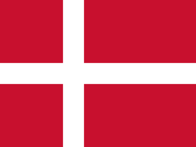
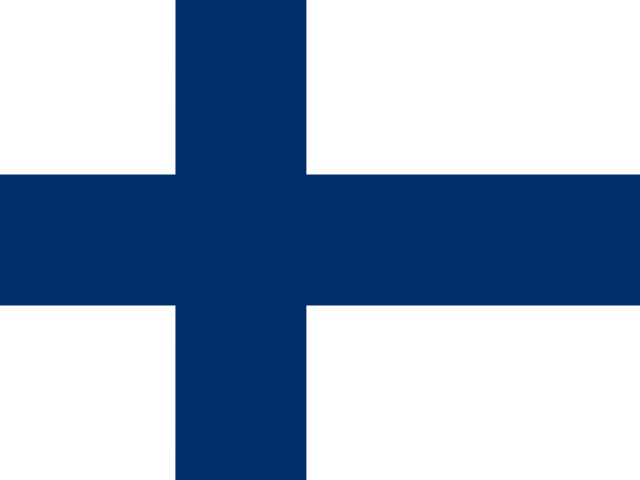
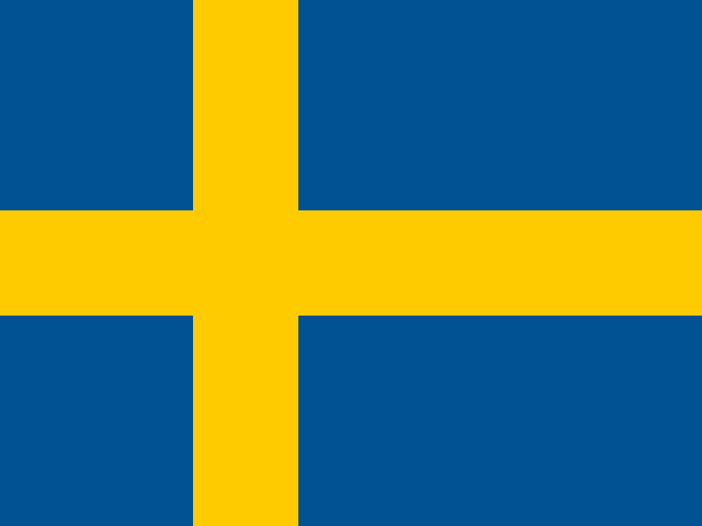
In Scandinavia—Denmark, Finland, Iceland, Norway, and Sweden—natural light conditions and a deep connection to the environment shape color perception. Light, clear tones dominate design, while strong accents come from flag heraldry. Sweden, for example, uses blue and yellow, Denmark red and white, Norway red, white, and blue. These national colors carry strong emotional weight and should be used respectfully in visual communication. Finland relies on white and blue for purity and water, Iceland on blue, white, and red for volcano and glacier.
In practice, this means: For the Scandinavian market, minimalism, high contrast, and a conscious reduction to a few powerful shades are suitable. Use blue in nuances like sky blue or navy to signal trust and stability—especially popular in Sweden and Norway. Yellow has positive connotations in Sweden but should not be overly dominant. Red is associated with coziness ("hygge") in Denmark and Norway but is perceived more as a warning color in Finland. Therefore, test red deliberately in different contexts.
Recommendations: For website localization in Sweden, a light, airy design with blue as the primary color and yellow for call-to-action buttons works well. In Denmark, red can be used as an accent for trust elements. In Norway, avoid overemphasizing flag colors outside national contexts. For Finland, blue and white are safe—opt for matte surfaces to emphasize the reduced aesthetic. An important nuance: In Iceland, earth tones and violet are significant in nature—show local affinity through such colors in limited editions or seasonal campaigns. Always have the color selection reviewed by a local native speaker to avoid cultural pitfalls.
Legal notice: The color recommendations provided are based on cultural observations. For legally protected color marks or regulatory requirements, please consult a legal advisor.
Colors in Western Europe: UK, France, Benelux
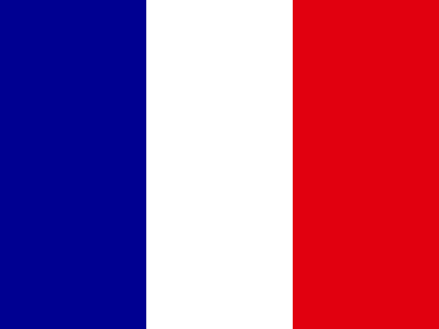
Western Europe comprises culturally diverse countries with their own color symbolisms. In the United Kingdom, red, white, and blue stand for the Union Jack, while green has a strong connection to nature and political movements. In France, the tricolor blue, white, red dominates—blue represents freedom and is often used in politics, white for equality, red for fraternity. The Benelux countries show national specifics: the Netherlands loves orange (royal family) and combines it with blue, Belgium uses red, yellow, and black, Luxembourg red, white, and light blue. In France, yellow can be associated negatively (envy, betrayal), while in the Netherlands it has a positive effect (royal family, energy).
For localization, you should consider these differences. In the UK, blue is suitable for trustworthy brands (finance, technology), while red creates attention and action—but not too much on national symbols. Green can stand for sustainability or rural life, but also for political parties; avoid overly strong political connotations. In France, blue is a safe choice for serious brands, white for luxury and minimalism. Red appears dynamic but often aggressive in advertising—use it sparingly. For Belgium and the Netherlands: orange is indispensable in NL for patriotic contexts, but not in Belgium. In Belgium, use combinations of red, yellow, and black for national references, but avoid political symbolism (e.g., Flemish lion).
Practical recommendations: Create color palettes that are tested separately in each country. For a French landing page, start with blue as the primary color, white as background, and red for accents. In the UK, use blue as a trust color and red for buttons—test green for environmentally friendly products. In the Netherlands, integrate orange sparingly, e.g., for special offers or seasonal campaigns. In Belgium, choose neutral colors for international brands and use national colors only for local campaigns. Have a native speaker review the color choice, especially for politically sensitive colors.
Legal notice: Color trademarks such as the red of certain logos or the orange of the Dutch royal house are protected. Before use in commercial contexts, legal review is advisable.
Colors in Central Europe: Germany, Austria, Switzerland
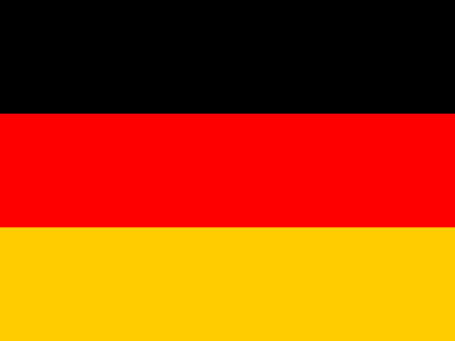
In German-speaking countries—Germany, Austria, Switzerland—national colors play an important role, but the specific associations vary by country and region. Germany stands for black, red, gold—these colors are frequently used in political and sports contexts. In business, blue is a dominant color for trust and professionalism (banks, insurance), green for environment and sustainability. Austria uses red and white, which are also common in tourism and traditional products. Switzerland relies on red and white—here red stands for courage and strength, white for peace and neutrality. In Switzerland, green is not only associated with nature but also politically (environmental parties).
In practice: For the German market, blue is a universal trust color—well suited for many industries such as finance, technology, or healthcare. Use blue shades from navy to light blue depending on the target audience. Red can attract attention, but especially in Germany it is often associated with warnings or price reductions. Gold or yellow appear high-quality, but not too dominant. In Austria, use red and white for regional affinity, e.g., for food or tourism offers. Avoid standalone red or white without context to prevent confusion with the flag. In Switzerland, red is linked to quality and precision—ideal for watches or banks. White as background stands for clarity and order. Green is suitable for sustainable products, but should not be over-interpreted politically.
Concrete action recommendations: Design your website for Germany with a blue primary color and white backgrounds, use red as an accent for calls to action. In Austria, you can use red for navigation and white for main content, supplemented by a subtle gold tone. For Switzerland, strong red for buttons and white for text areas are recommended—maintain a clean, minimalist line. Always test localized color concepts with a small user group to avoid cultural misinterpretations. A typical mistake: using green in Germany for products from Switzerland—this could encounter wrong political associations. Involve native speakers in the final review.
Legal notice: Brands with color trademarks (e.g., the blue of a well-known German bank) are protected. For specific legal advice, contact your legal department.

Colors in Southern Europe: Italy, Spain, Portugal, Greece
In Southern Europe, color meanings are often shaped by the Mediterranean lifestyle, Catholic tradition, and a vibrant everyday culture. In Italy, Spain, Portugal, and Greece, colors carry a strong emotional charge that brands can strategically leverage.
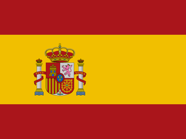
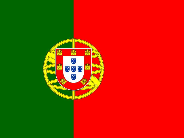
Red in these countries stands for passion, energy, and joie de vivre. In Italy, red is associated with the Catholic Church (cardinal purple) and communist tradition—a balancing act for brands. In Spain, red is the color of bullfights and the national flag, but also of love. Wine tones like burgundy appear elegant, while a bright red can be perceived as provocative. Yellow symbolizes the Orthodox Church and the light of the Aegean in Greece, while in Spain it represents the sun and summer. Blue has a strong maritime significance in all countries: from the deep blue of the sea to the light blue of the sky. In Greece, the famous Cycladic blue (light blue) is a symbol of purity and national pride. Green is primarily associated with agriculture and olive groves, and in Italy also with the environmental movement.
For practical localization, this means: Use bold, saturated colors that radiate vitality in Southern Europe. A pale color scheme quickly reads negatively. Food industry companies often use red and yellow (e.g., for pizza or tapas), while luxury brands rely on black and gold. Be mindful of local taboos: In Spain, yellow is partly associated with bullfighting (capote)—not always suitable for medical products. Test color schemes before rollout with local focus groups, especially for religious symbolic colors like violet during Holy Week.
Concrete recommendation: Create a color matrix per country: primary colors for the brand, secondary colors for promotions, and neutral background colors. Use local color names (e.g., "Rosso Ferrari" in Italy or "Rojo Pasión" in Spain) to strengthen emotional bonds. Avoid politically charged color combinations (e.g., red-yellow in Catalonia without a neutral counterpart).
Colors in Eastern Europe: Poland, Czech Republic, Hungary, Baltics
Eastern Europe has a complex color history shaped by Slavic traditions, Soviet past, and national revivals. Poland, the Czech Republic, Hungary, and the Baltic states show clear differences that brands should consider when localizing.
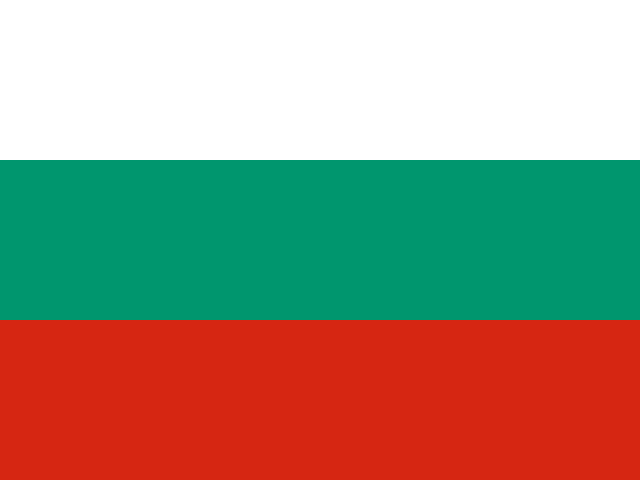
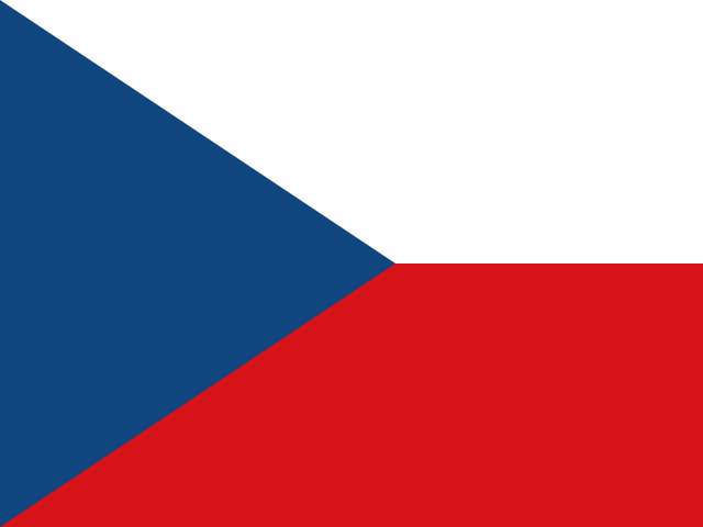
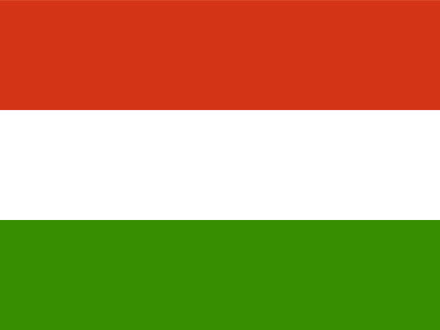
National colors play a prominent role: In Poland, white and red are not only state colors but also symbols of independence. Brands should avoid this combination unless a patriotic reference is desired. The Czech Republic uses white, red, and blue—here blue is unproblematic, while red is more associated with revolution. Hungary uses red, white, and green; green has strong agricultural and national significance there. In the Baltics (Estonia, Latvia, Lithuania), blue, black, and white dominate, representing forest, sea, and freedom.
A major challenge is the association of many colors with the communist era. Red was the color of the Soviet Union and is often viewed skeptically in countries like Poland or the Czech Republic—especially in combination with hammer and sickle. Even the formerly ubiquitous "Soviet gray" leaves a negative impression. At the same time, traditional folk colors (such as red in Hungarian embroidery or blue in Polish ceramics) are experiencing a renaissance. Violet and pink are seen as Western and modern but are less established in rural areas.
For your localization: Use clear, strong colors with positive national references. In Poland, favor blue for trust (as many banks do) and green for naturalness. In Hungary, yellow can appear sunny and optimistic, while black is accepted in fashion and luxury. In the Baltics, a navy blue color scheme suits technology companies. Avoid color combinations that resemble neighboring countries' flags (e.g., red-white-red in Austria is similar to Latvia but has different connotations there). Always test the effect of red on older target groups—it can be perceived as politically charged.
Concrete recommendation: Conduct a cultural color audit with local experts. Adapt your color palette not only per country but also per region (e.g., Munich vs. rural Bavaria in Germany, analogously Warsaw vs. rural Poland). Document the meaning of each color in your style guide to avoid errors within the international team.
Color symbolism in religious and historical contexts
Europe is shaped by centuries of religious and historical events that imbue colors with deep, often unconscious meanings. For visual localization, these contexts are especially relevant, as they are interpreted completely differently depending on the country.
In Christianity, the liturgical color scale dominates: in Catholic and Orthodox countries, each color has a fixed place in the church year. Violet represents penance and Advent – in Southern Europe and Poland it is strongly associated with mourning and reflection. Red is the color of the Holy Spirit and martyrs, but is also used for Pentecost and Palm Sunday. Green symbolizes hope and everyday life. These liturgical colors influence everyday perceptions: a violet logo may be perceived as religious or melancholic in Italy or Spain. White stands for purity and weddings (bridal gown) throughout Europe, while black is traditionally the color of mourning – in Southern Europe, mourning is often combined with black, while in Northern Europe gray is increasingly used.
Historical contexts are equally important: In Germany, brown is heavily burdened by the Nazi past – even earthy brown tones can evoke negative associations. In Eastern Europe, red is problematic as the former state color of the Soviet Union or socialist regimes. In Spain, the flag of the Second Republic (purple/red-yellow-violet) recalls a political era. The Habsburg monarchy also left its mark on color codes: black-yellow for imperial colors, red-white-red for Austria. These historical symbolisms are not obvious, but are relevant for older target groups.
For localization practice: avoid color combinations that evoke historical flags or political parties – e.g., black-white-red in the German context, red-black in Spanish regions, or blue-yellow (Ukraine) in Russia-friendly markets. Check religious taboos: in Catholic countries, the combination of purple and green may appear too ecclesiastical. Use neutral colors like blue, gray or beige in sensitive contexts. Always test your color choices locally, ideally with representatives from different age groups, as historical resonances are only recognized by insiders.
Concrete action recommendation: Research the most important religious holidays and historical commemorative days in each country. Adapt your color choices for time-limited campaigns (e.g., Easter or national holidays). Develop an internal database of historically charged color combinations per country. Obtain legal advice if you plan to use state symbols.
Colors are more than design: They convey deeply rooted cultural messages. In Europe, color meanings vary from north to south – what stands for trust in Scandinavia may trigger rejection in Southern Europe. Our guide shows you how to optimally localize your color palette for each European market, maintain brand identity, and avoid emotional pitfalls. Practical with checklist and methods.
Colors and Brand Identity: Consistency vs. Adaptation
The challenge in internationalizing your brand lies in finding the right balance between a consistent brand identity and adapting to local color meanings. A globally uniform color scheme creates recognition and trust among your customers, but can evoke negative associations in certain markets. In practice, a flexible strategy has proven most successful, where core colors are retained but accent colors are adapted locally.
Start with an analysis of your existing color palette: Which colors are identity-defining for your brand? These should be retained as much as possible, unless they are taboo in a target market. For example, dark blue – associated with trust and reliability in many countries – works well even in conservative markets like Germany or France. Problems arise when your brand color has an opposing meaning in a country. In that case, consider substitution: replace the problematic color with a similar shade that has appropriate symbolism. This way, you can largely maintain visual consistency.
Also check whether your color choice harmonizes with local industry standards. In the financial sector of Southern Europe, for instance, muted blue tones are common, while in Scandinavia even light pastel colors are considered serious. A good method is to divide your palette into three categories: core colors (retained globally), support colors (adjustable per market), and accent colors (flexibly localized). This keeps the brand recognizable without risking cultural pitfalls.
Document your decisions in a style guide that records the meaning of colors and reasons for adaptations for each target market. This guide serves as a binding reference for all localization teams and agencies. Note that colors do not act in isolation: contrasts, brightness, and combinations with other elements (such as logos or typography) also influence the effect. Therefore, always test your localized color palettes with a local target audience before rolling them out.

Case Studies: Successful and Problematic Color Strategies
Successful color localization is evident, for example, with a Northern European furniture brand that retains its characteristic blue in most markets – in Germany and France, blue stands for stability, while in Italy it is perceived as cool. There, the company instead uses a warmer turquoise as a secondary brand color, conveying both Mediterranean lightness and brand values. After the adjustment, sales in Italy increased by around 15 percent.
Another positive example: A Dutch logistics company used a strong orange in all its communication – in the Netherlands, orange is associated with national pride and dynamism. However, for entering the British market, orange was less suitable, as it is often associated with discount brands there. The company switched to a dark teal as its primary color and kept orange only as an accent. Brand perception improved significantly, as focus groups showed.
Problematic cases illustrate how colors can be interpreted completely differently in new markets. An Austrian confectionery manufacturer introduced packaging with large areas of purple in Poland – there, purple is traditionally considered a mourning color. Sales figures fell far short of expectations until the packaging was changed to a friendly yellow. A US technology company used a red accent color for its user interface in France – but in France, red is associated with losses and warnings. After switching to a soft beige, user acceptance improved significantly.
Learn from these examples: Test your color strategy with local consumers before launch and adjust based on concrete feedback. Pay attention not only to the color itself but also to its combination with shapes and fonts – a color never works in isolation. Additionally, a competitive analysis helps you identify common color codes in your target market's industry. Document all insights to draw on them for future localizations.
Toolbox: Practical Steps for Localizing Your Color Palette
To systematically localize your color palette for various European markets, we recommend a multi-step approach. First, create a list of all relevant countries and note cultural color meanings based on reliable sources such as professional publications or local market research. Also use resources like color meaning databases that are based on empirical studies. Avoid relying on general stereotypes.
In the second step, assign your brand colors to the target markets. Use an evaluation matrix: Rate each color on a scale from -2 (strongly negative) to +2 (strongly positive) in relation to your brand values. Colors that receive a negative rating in a market should be replaced with alternatives. To select suitable alternatives, consider colors with a similar psychological effect – for example, a rich green (positive for nature-connectedness) can be replaced with a blue-green if green is considered an unlucky color locally.
Third: Define an adapted palette for each market that includes core colors (maximum two) and flexible accent colors. Document the exact color codes (HEX, CMYK, RAL) and add a rationale for each adjustment. Create mockups for typical applications such as website, packaging, or advertising materials to check visual harmony.
Test your adapted palettes with a small local target group before final implementation. Use simple online surveys or focus groups for this. Ensure that respondents evaluate not only the colors but also the overall composition. Iterate based on feedback. Finally, integrate the localized palettes into your brand guide and ensure that all team members and external partners have access to the current specifications. Plan regular reviews, as color perceptions can change slowly.
Note: Clarify the legal aspects of brand colors – such as color protection as a registered trademark – with your legal department before making changes.
Checklist: Cultural Color Check Before Market Launch
Before launching in a new European market, systematically check your color palette for cultural compatibility. The following checklist helps you avoid potential misinterpretations and address local emotions precisely.
Start with basic research into the historical and political associations of each color in the target country. Check whether certain colors are linked to political parties, religious groups, or national symbols. For example, in Ireland, green strongly represents Catholicism and Irish identity, while orange is associated with Protestantism. In Eastern Europe, certain shades of red or blue might evoke memories of former regimes. Use local market research or native speakers to identify these nuances.
Analyze the color usage of local competitors and industry leaders to uncover unconscious standards. In many Western European countries, pastel tones often signal sustainability and naturalness, while in Southern Europe, bold colors like yellow or orange convey energy and sociability. Also pay attention to the symbolism of color combinations: In France, the combination of blue, white, and red can evoke national references – fitting for some brands, risky for others.
Test your color palette with the target audience using A/B tests or focus groups. Have local users share their spontaneous associations. Cultural differences in Europe are particularly pronounced for primary colors such as red, green, blue, and yellow. Document the results and establish an adapted color strategy for each market. Important: Also document why certain colors were discarded, so you can refer back to this information during future updates.
Create an internal color framework that defines country-specific alternatives alongside global brand colors. This keeps your visual identity recognizable while respecting local sensitivities. Plan regular reviews, as cultural color meanings can evolve over time. This checklist is a living document that you should refine with each market launch.
Outlook: Trends and Dynamic Evolution of Color Symbolism
Color symbolism in Europe is not a static concept but undergoes constant transformation. Globalization, digital media, and societal movements create new meanings while traditional associations fade. For internationalization strategists, this means that a one-time color analysis must be regularly updated.
A current trend is the increasing connotation of colors with sustainability and environmental awareness. Earthy tones like olive green, terracotta, or beige represent ecological responsibility in many European countries – even in regions where green traditionally has different connotations. At the same time, pastel and neon colors are gaining importance in the fashion and lifestyle sectors, as younger target groups perceive them as modern and inclusive. This development partially overlays historical color meanings.
Digitalization and social media also strongly influence color perception. Brands active on platforms like Instagram or TikTok often adapt their colors to prevailing aesthetics there – for example, minimalist black-and-white combinations or bold contrasts. This global visual language can bridge local idiosyncrasies but can also cause conflicts if it ignores traditional symbolisms. Observe how younger audiences in different countries reinterpret colors.
Political and social developments also shape color symbolism. For instance, the Yellow Vest movement in France temporarily altered the perception of yellow, even if the effect was not lasting. The LGBT movement has positively associated rainbow colors across Europe. For brands, this means they should react flexibly to current events without appearing opportunistic. Regular analysis of local news and cultural discourses is recommended.
In summary, leave room for adjustments in your localization strategy. Build a system that enables seasonal, trend-based, or event-driven color changes without losing core identity. Collaborate with local trend scouts and cultural writers to recognize early when a color loses its innocence or opens up new opportunities. This continuous process ensures that your visual communication remains relevant and respectful.
Common Pitfalls in Color Localization and How to Avoid Them
When adapting colors to local markets, several pitfalls lurk that can surprise even experienced brands. A common mistake is assuming that international color standards are universally understood. For instance, white is associated with mourning in Japan, while in Western Europe it stands for purity. Even within Europe, there are nuances: In the Netherlands, orange symbolizes national pride, but in other countries it may be perceived as intrusive. Brands often overlook the impact of color combinations. Red and green are considered festive in many contexts, but in healthcare they can cause confusion, as they resemble traffic lights or warning signs. Another issue is neglecting undertones: Cool blues may appear cold in southern countries, while warm reds can be seen as aggressive in Northern Europe. Saturation also plays a role – pastel colors are appreciated in Scandinavian countries, while stronger shades are preferred in Southern Europe. To avoid these pitfalls, conduct qualitative tests with focus groups in each target market before launch. Be sure to check not only primary colors but also secondary colors and backgrounds. Another stumbling block is failing to account for color blindness: An estimated 8% of men and 0.5% of women in Europe are affected. Use high-contrast combinations that remain legible for this user group. Additionally, consider legal restrictions: Medical devices in the EU are subject to specific color regulations (e.g., blue for markings). Therefore, consult local legal experts. A practical tip: Test your color palette separately in print and digital media, as screens display colors differently from paper. Also avoid adopting trend colors without context – while pastels were fashionable in 2023, they may appear unprofessional in conservative markets like Switzerland. Record the reactions of local team members or partners and document deviations to incorporate into future localizations.
Budget Planning and Time Investment for a Color Strategy per Market
Localizing a color strategy requires realistic budget and time planning that many companies underestimate. As a rule, you should plan for 10 to 30 working days per target market, depending on the complexity of your brand and cultural differences. The costs consist of several items. First: research and analysis. This will cost approximately 1,000 to 5,000 euros per market if you engage external cultural consultants or specialized agencies. In-house research reduces costs but increases the risk of misinterpretation. Second: creative implementation. Adapting the logo, packaging, and advertising materials can range from 3,000 to 15,000 euros per market, depending on scope. Add costs for design variants that should be tested by a panel of local native speakers. Third: testing and validation. We recommend focus groups of 20 to 40 participants per market, costing between 2,000 and 8,000 euros depending on the provider. Ensure participants are representative of your target audience, not just students. Fourth: implementation and quality control. Final integration into all touchpoints (website, app, packaging, stores) requires additional budget for print proofs and software adjustments – expect 2,000 to 6,000 euros per market. The time commitment is spread over several months: from initial research to market launch, you should allocate at least three to six months. A common mistake is implementing the color strategy in parallel with overall market localization. Instead, we recommend starting with a pilot market to gather experience. This step reduces costs and risks in the long run. Also plan a buffer budget of 20% for unexpected changes, such as regulatory updates or requests from local retailers. A practical tip: Negotiate package prices with agencies for multiple markets to leverage synergies. Document every step in detail so that the insights gained can be transferred to other markets – this saves time and money in future localizations. Note that budget and time investment depend heavily on your industry: The luxury segment requires more extensive testing than everyday consumer goods.
FAQs
Which methods are suitable for researching color symbolism in a European target market?
For thorough research, combine qualitative interviews with local experts, analysis of color usage in established brands and media, as well as historical studies of the region. Also use surveys among your target audience to identify current associations. Be sure to identify not only positive but also negative or taboo colors. In practice, a mix of secondary research and primary data collection has proven effective for capturing cultural nuances.
Can I keep my global brand color or do I need to adapt it for each market?
In principle, you do not have to change every color, but critically assess whether your brand color evokes negative associations in the target market. In many cases, a local adaptation of secondary colors or accents suffices while the primary color remains unchanged. The key is to understand the emotional impact: a red that signifies luck in China can symbolize mourning in South Africa. Therefore, plan a cultural color check for each new market before finalizing the palette.
What typical mistakes occur in color localization in Europe?
Common mistakes include assuming colors are universal and ignoring regional religious or political connotations. For example, purple in Ireland is strongly associated with feminism, while in Italy it can be a mourning color. Using national colors can also be problematic if they are historically burdened. Another mistake is relying too heavily on local trends without considering long-term brand identity. Avoid these pitfalls through thorough research and, if necessary, testing before launch.